Tiga

UX DESIGN

WEB DESIGN

Project Type: Client Work |Role: Sole Designer | Duration: ~2 Weeks

Introduction

Our project centres on the redesign of Tiga's website, with the primary tool being Webflow.

Our objective is to deliver two distinct design concepts within the span of two weeks, utilising Figma as our design and prototyping tool. Then, create a full fledged website.

Upon approval of one of the design concepts, we will proceed to the next phase, which involves implementing the chosen design into Webflow. Alternatively, we can explore the possibility of creating the concepts directly in Webflow to expedite the development process.

This project will not only enhance Tiga's digital representation but also optimise their online presence to cater to both commercial and residential audiences more effectively. We are excited to embark on this journey and are committed to delivering an exceptional end product.


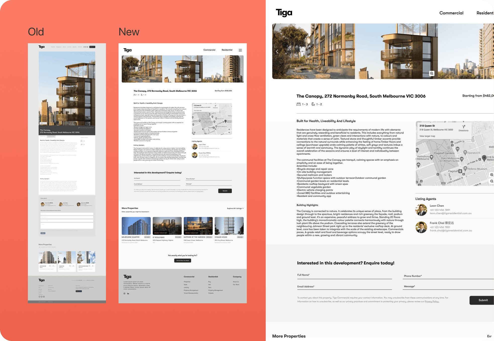
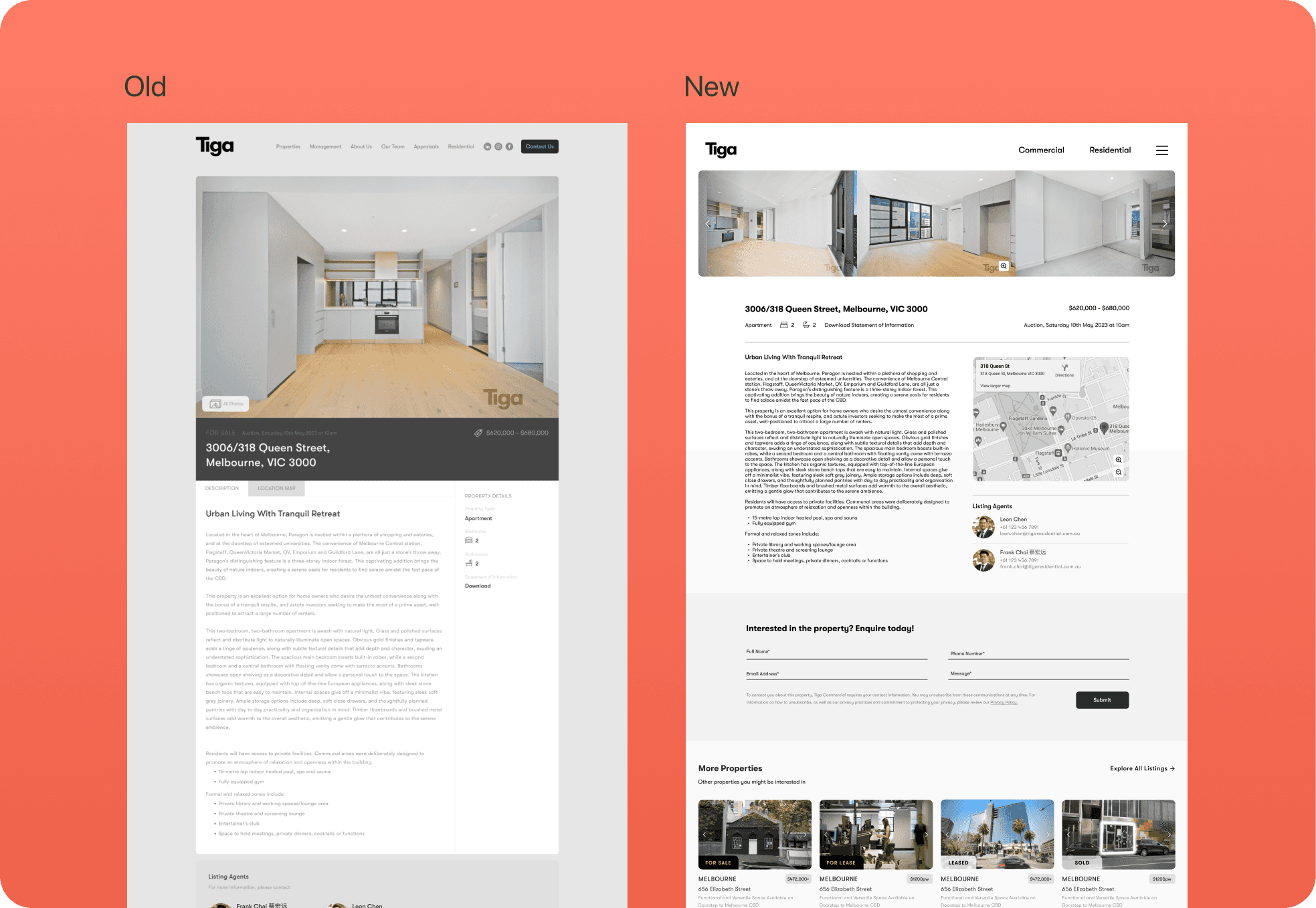
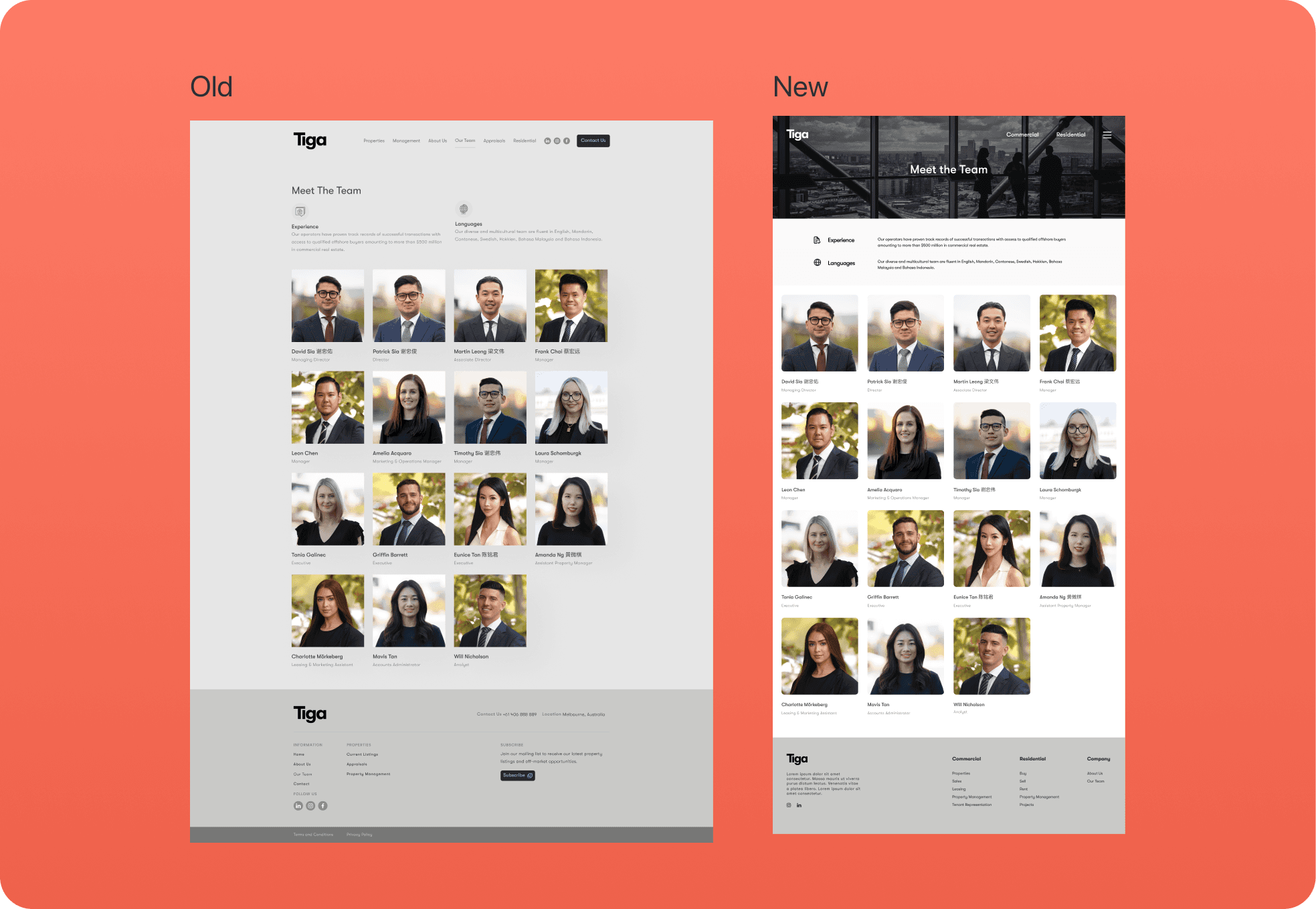
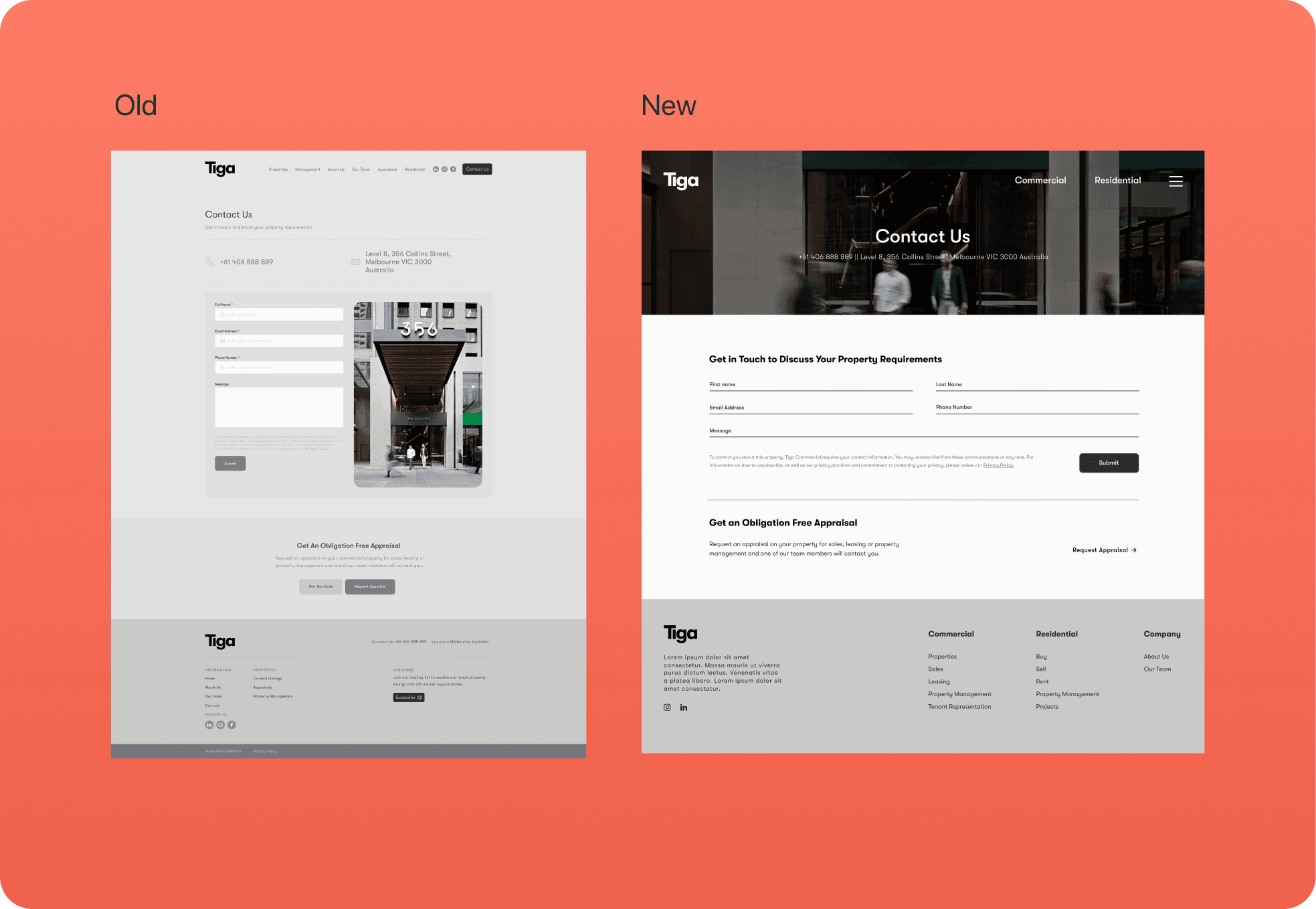
Issues with the Old Website

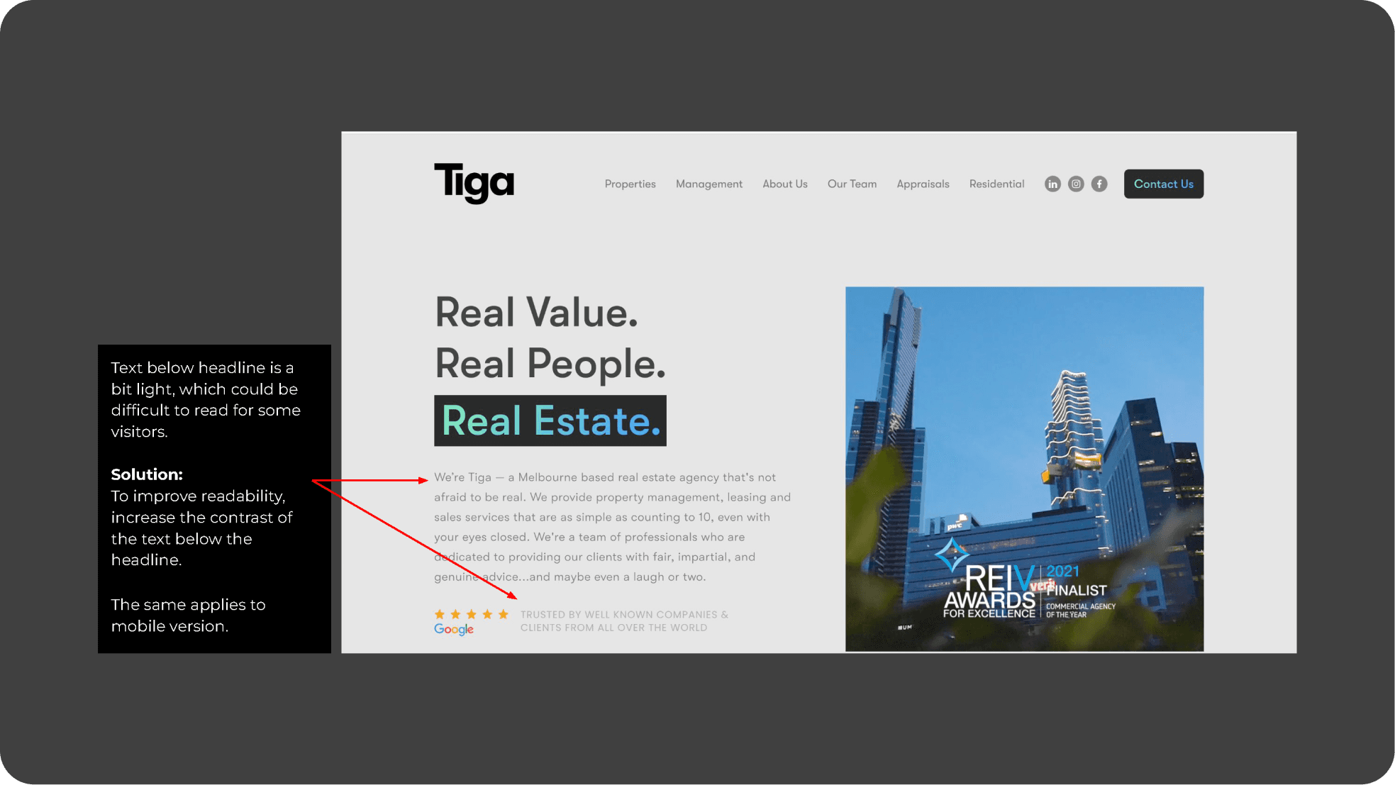
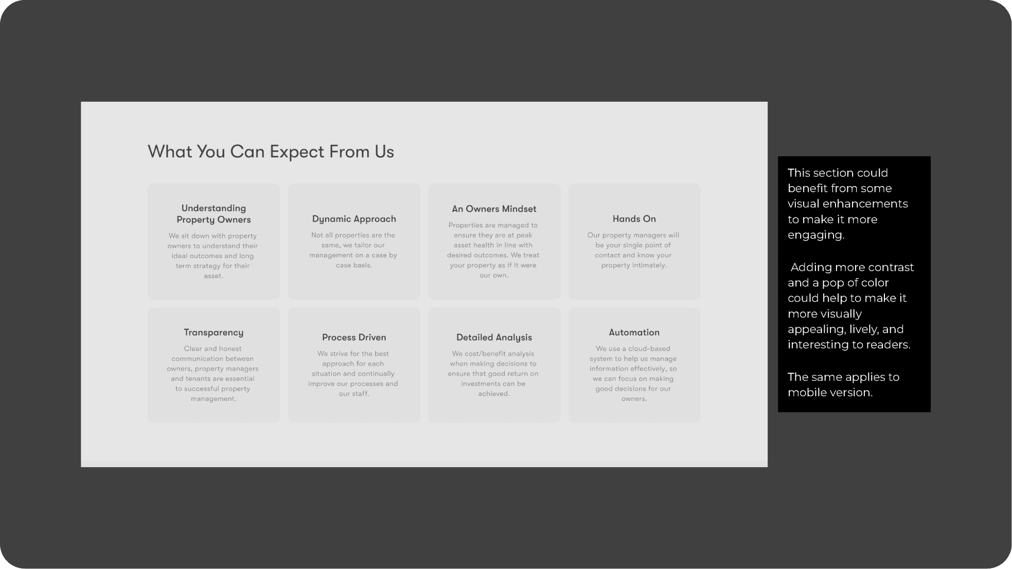
  • Low text contrast: Some text had low contrast against the background, making it challenging to read.

  • Text length: Text on text-heavy pages was often overly lengthy. We aimed to make it more concise, as website users often prefer shorter content for better engagement.
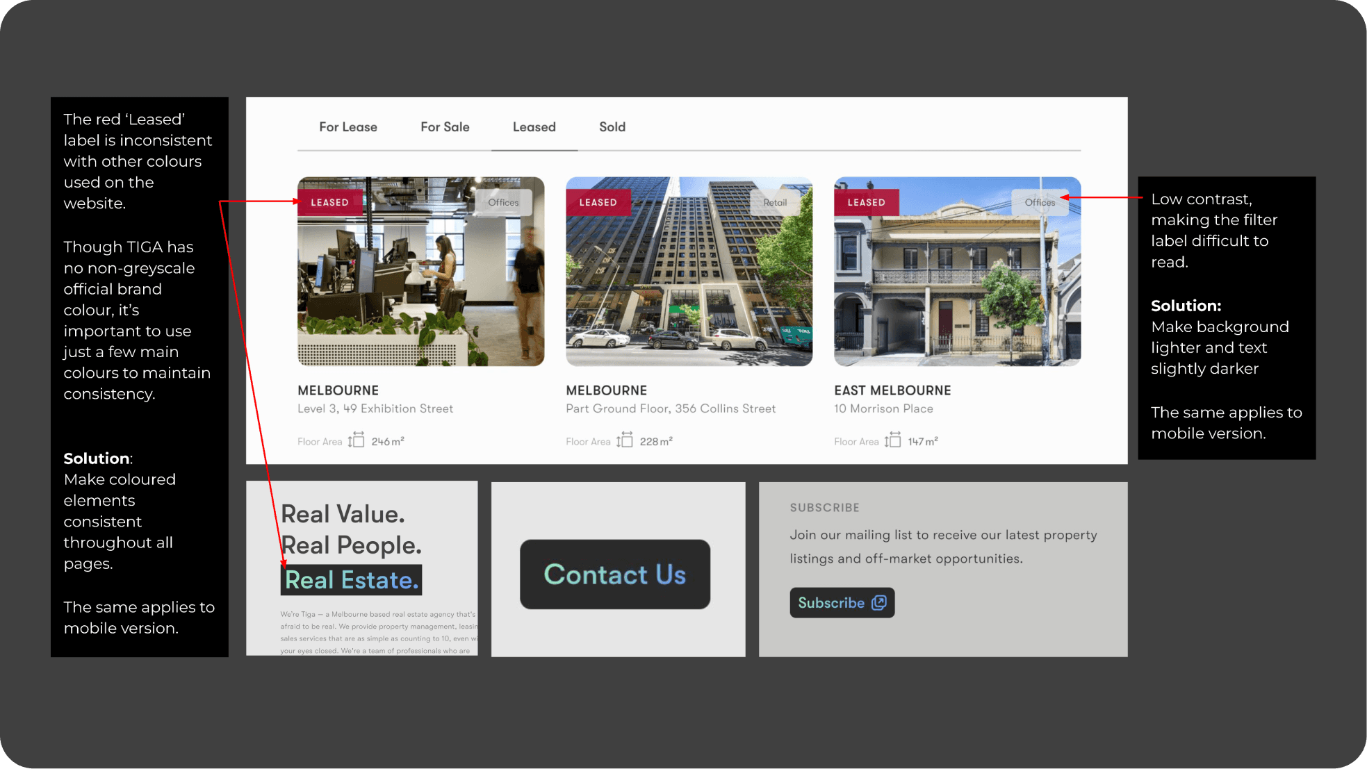
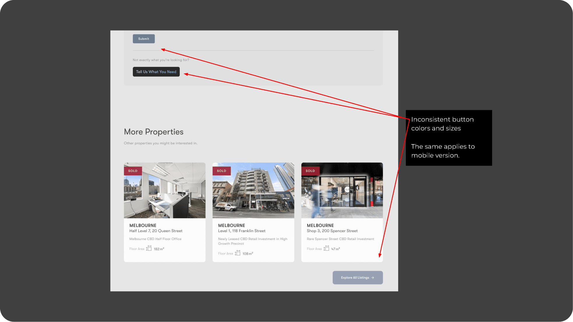
  • Inconsistent button color and sizes: Button design was inconsistent, impacting the user experience.
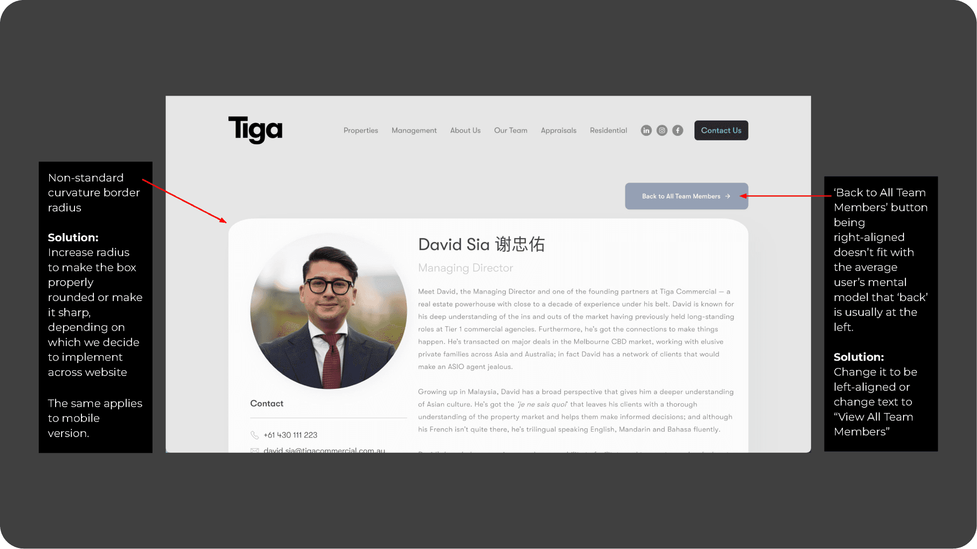
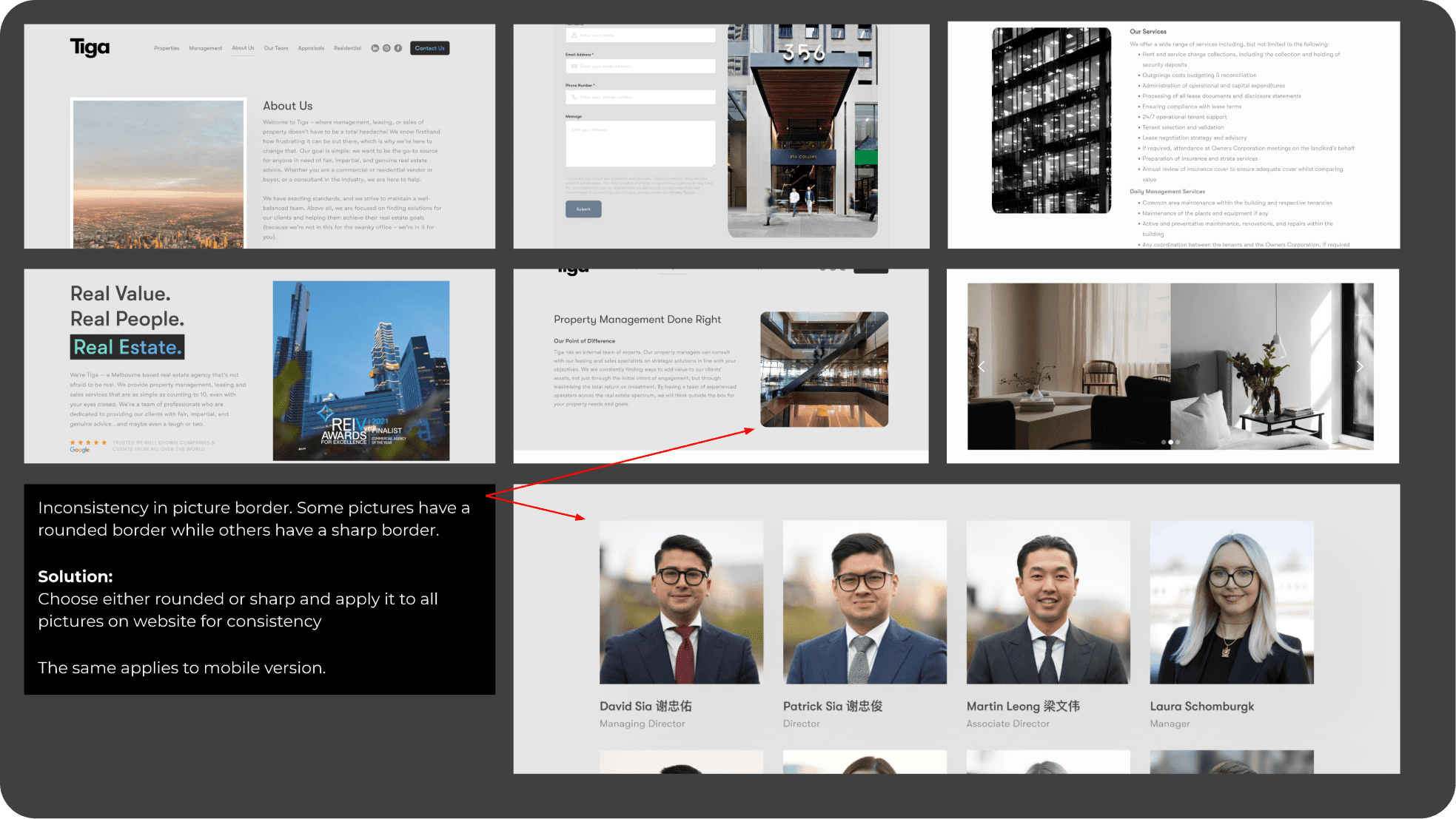
  • Inconsistent picture borders: There were inconsistencies in picture borders across various sections of the site.
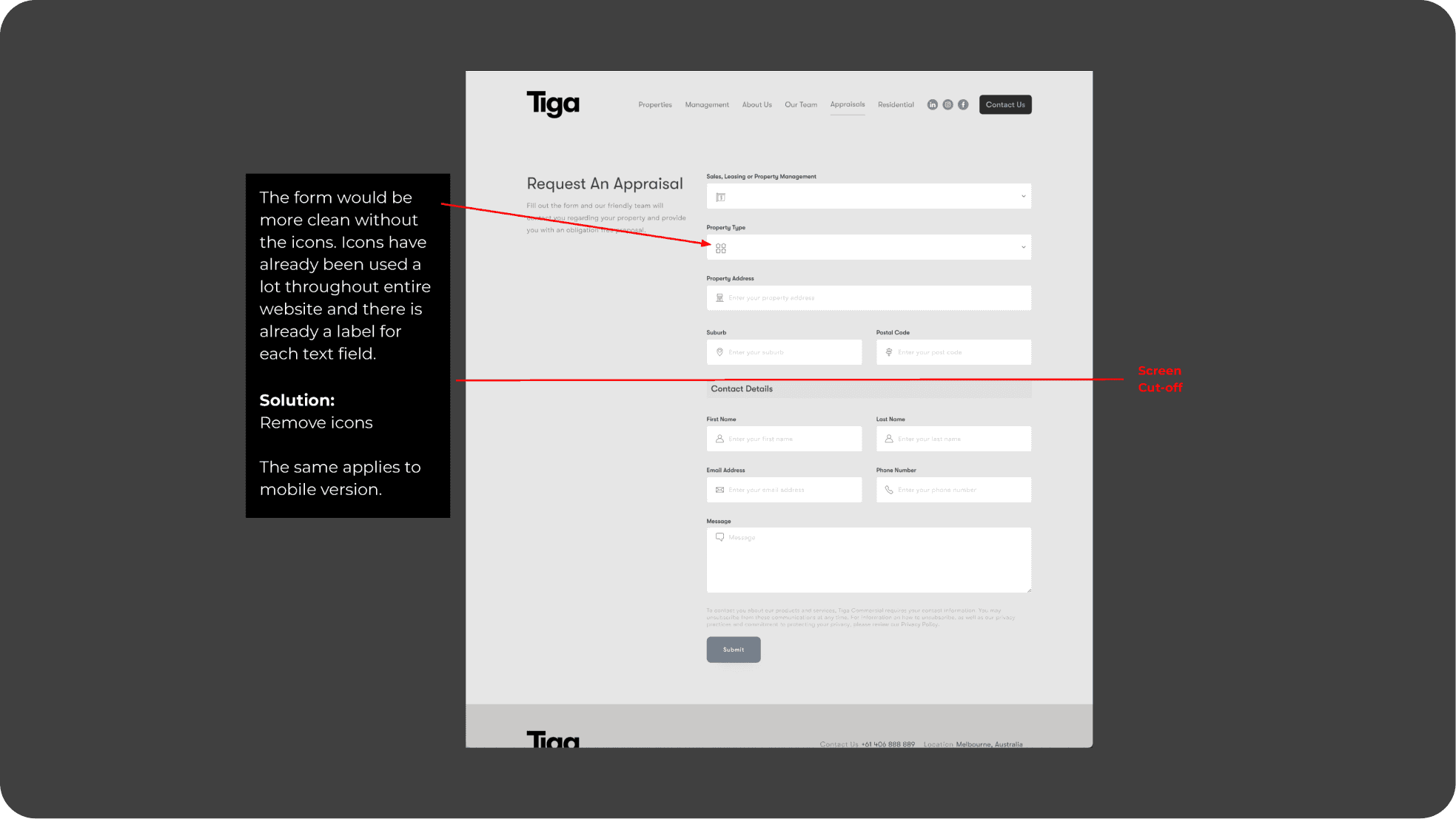
  • Overuse of icons: The website suffered from an excessive use of icons, which affected its visual clarity.

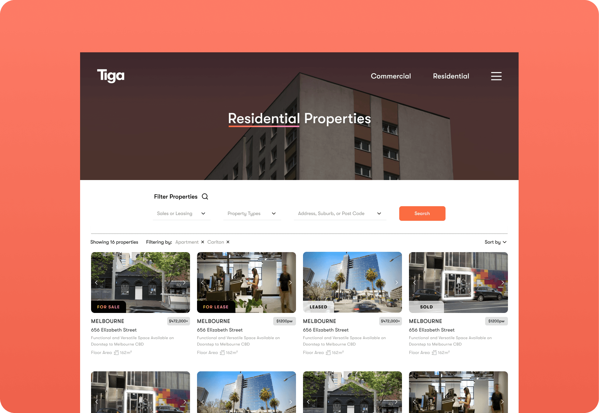
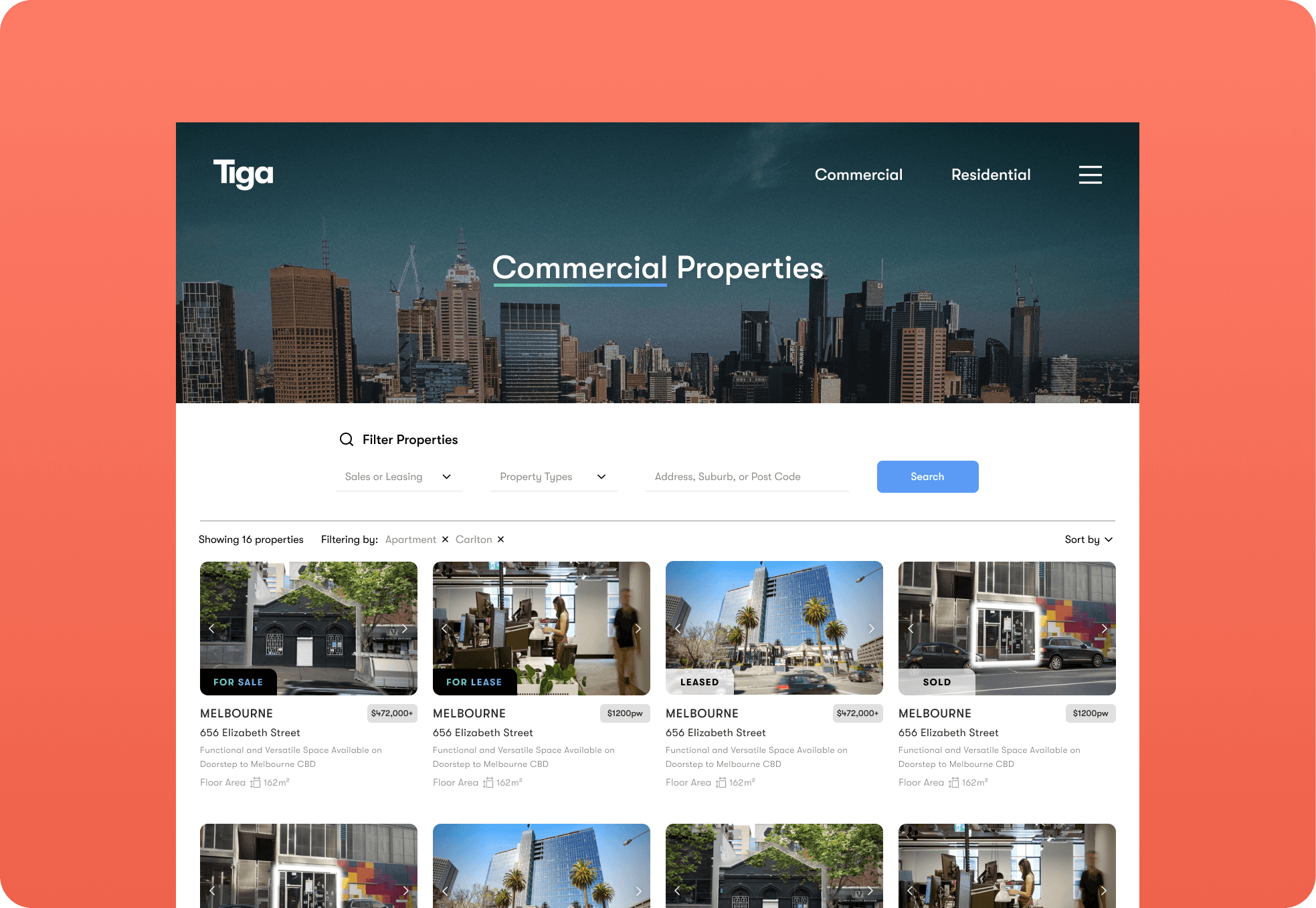
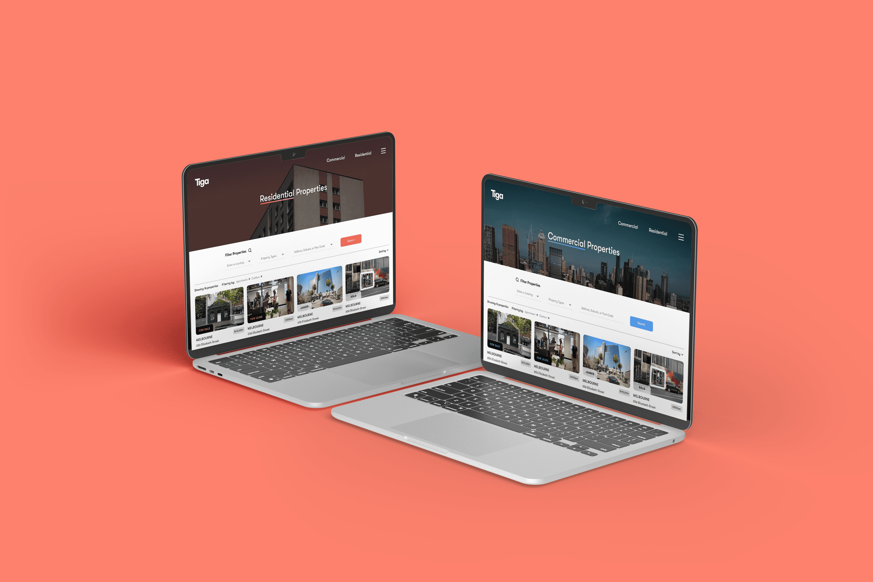
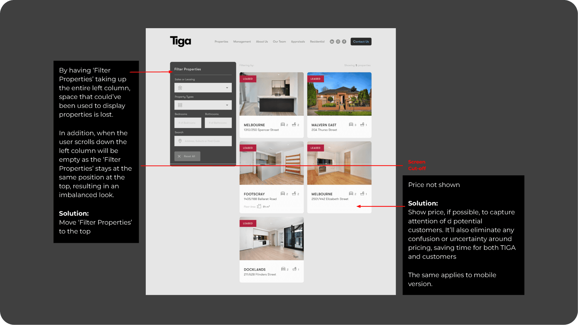
  • Space optimisation: The properties page had untapped potential for better space utilization. Placing the 'filter' section at the top could be more efficient.

Two Initial Concepts

Concept 2 description, goals, and visual elements. Check out the screenshots for a glimpse of this concept.


Post-Client Feedback

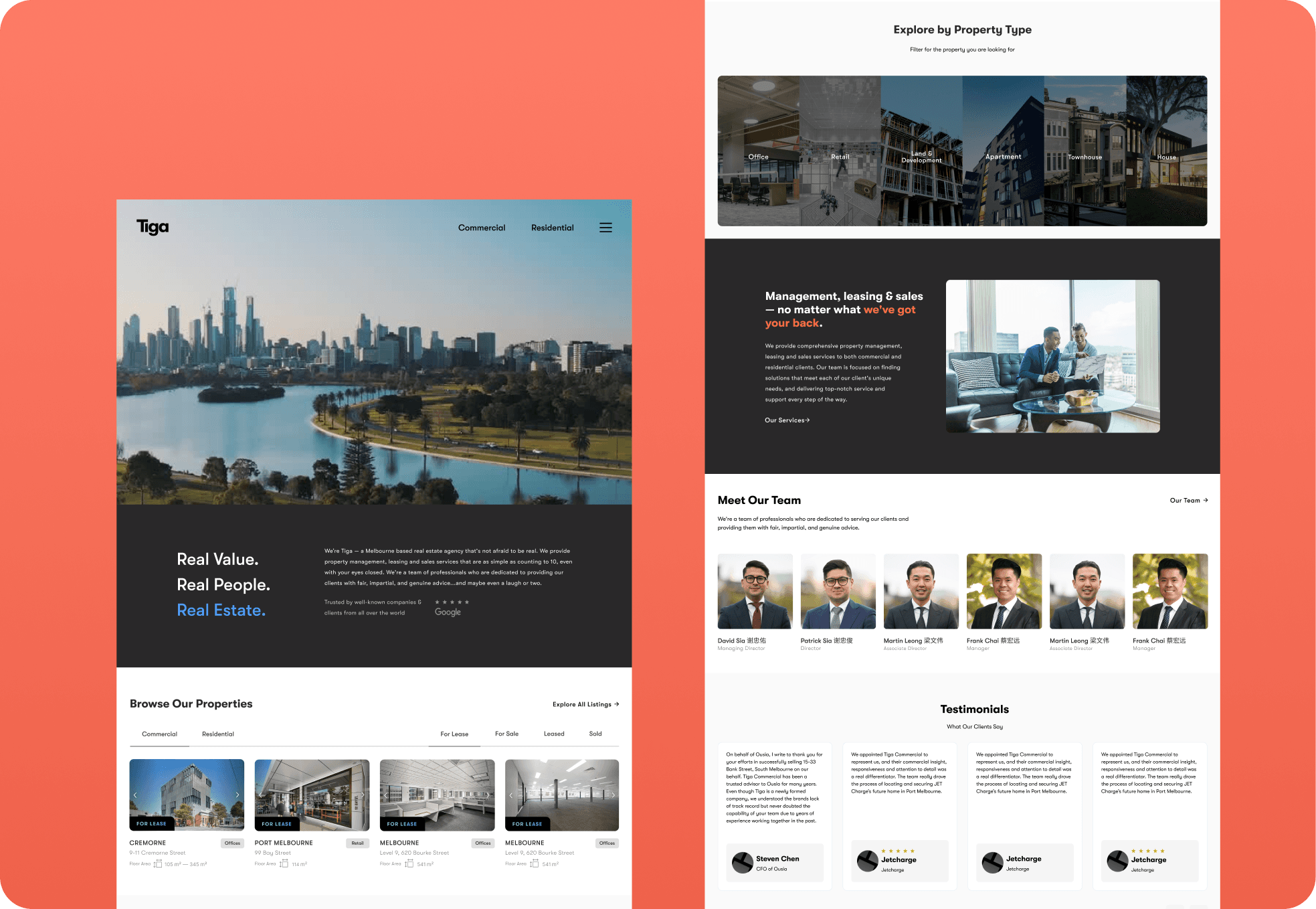
After receiving feedback from the client, we decided to combine the two design concepts to create a unified vision for Tiga's website.


The Challenge

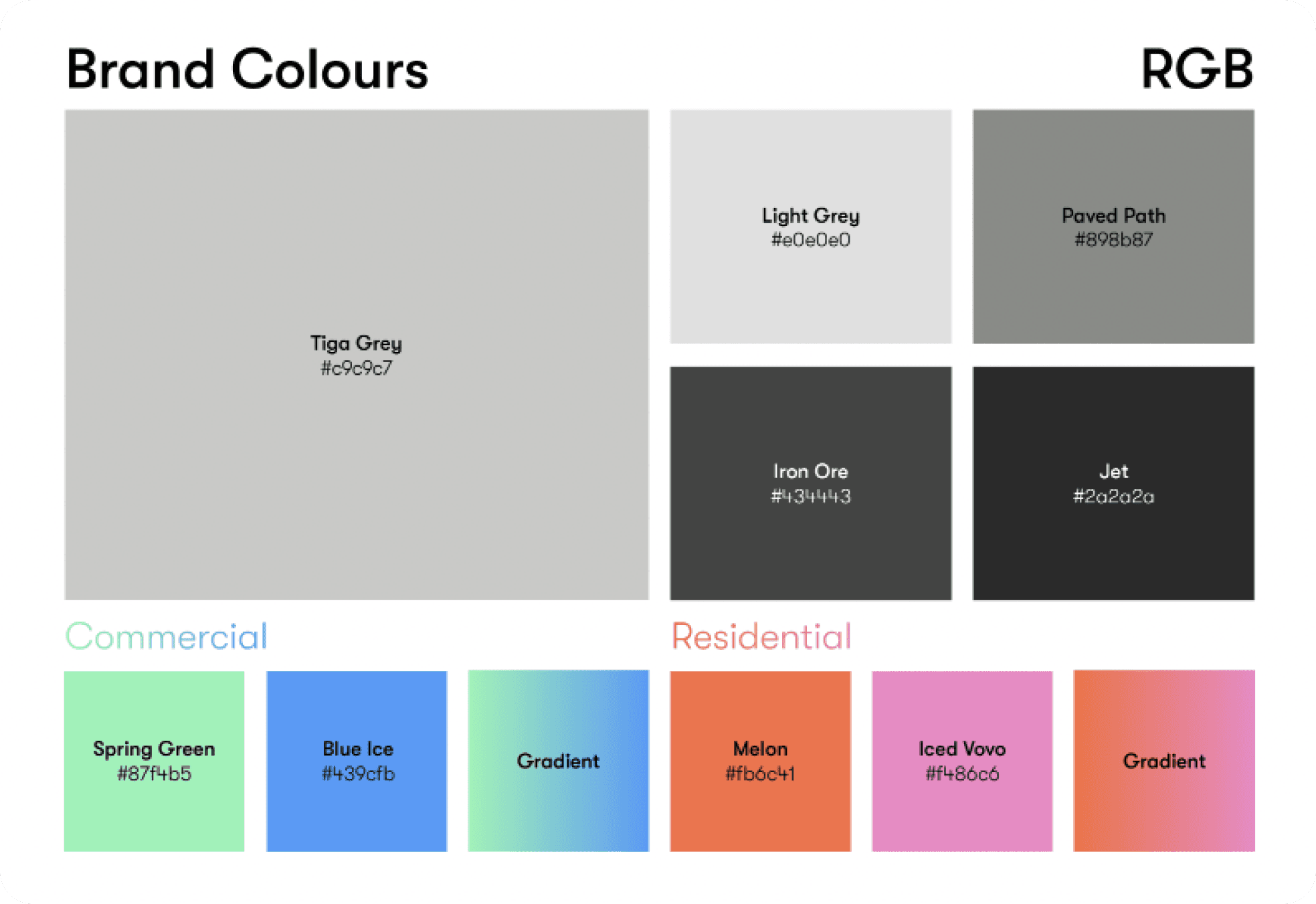
Since changing the brand colour was not possible, One of the key challenges in this project was effectively harmonizing the current brand's colours to create a modern, vibrant, and engaging look.

I resorted to using the colours and gradients only where needed, and utilised more of the greyscale colours so that it wouldn't be too hectic.


Prototyping

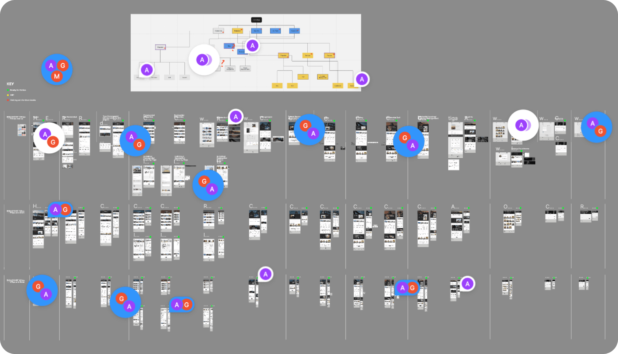
Over the course of two weeks, I diligently created over 50 pages spanning across three breakpoints. This process involved continuous communication with the client to ensure we were on the same page every step of the way.

Implementation

The developer has implemented most of the design on Webflow. However, not all my designs are accurately represented yet, as can be seen on the individual property page. It's a work in progress, but feel free to check out the website!