National Bowel Cancer Screening Program
Duration: 4 months
Role: While I was involved in research and various aspects of the project, my primary focus was conceptualising and developing digital prototypes for the website, as well as designing polished presentation visuals for reports to both the university and the client.
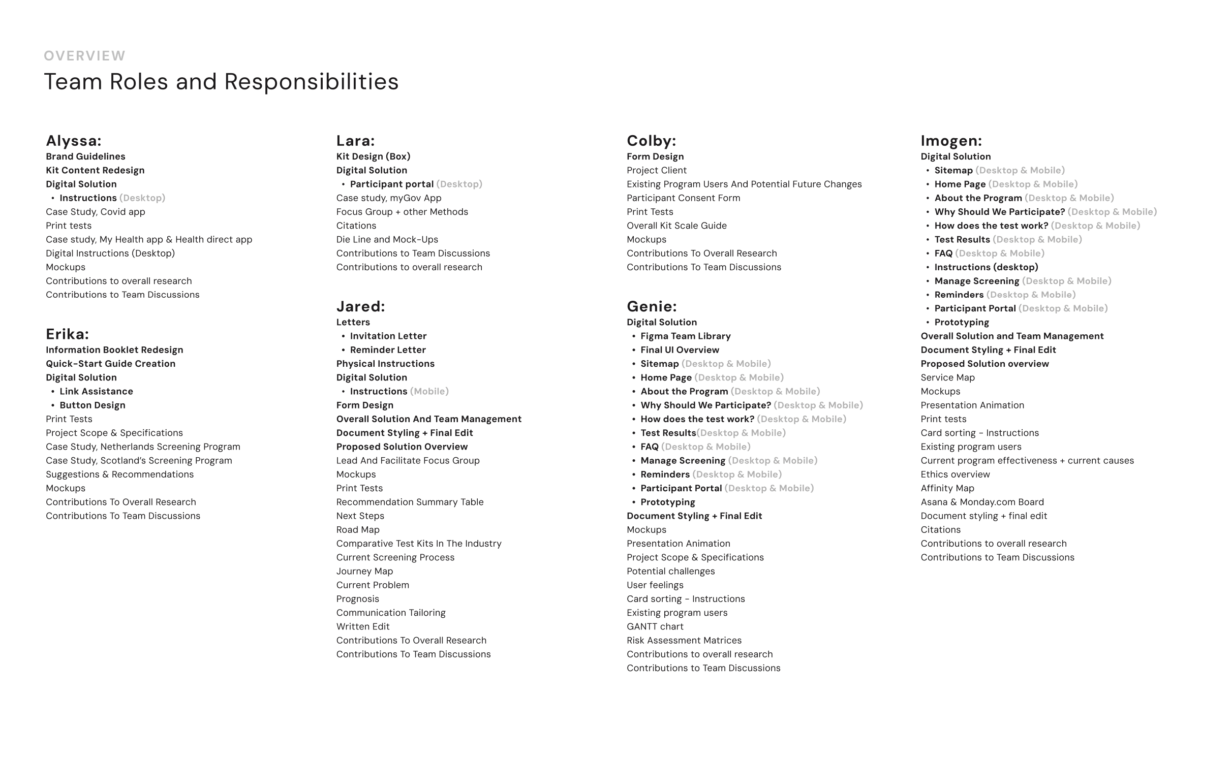
Collaboration: 6 other designers and researchers (Full list of roles and responsibilities below)
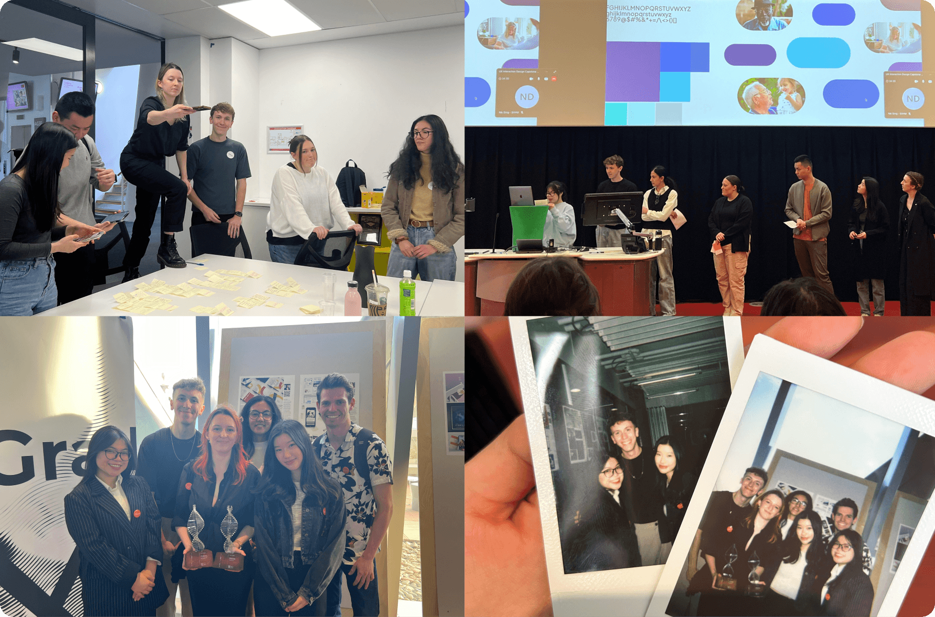
Award: 🏆 Capstone Excellence – Swinburne University of Technology
View Presentation | View Web Prototype
Background
Bowel cancer is the second leading cause of cancer-related deaths in Australia, yet participation in the National Bowel Cancer Screening Program (NBCSP) remains critically low. Only 44% of the distributed at-home test kits are returned.
To address this, the Aikenhead Centre for Medical Discovery (ACMD) convened a focus group of health experts and recommended leveraging digital technology to raise participation by at least 10%. As part of this initiative, our capstone team was tasked with researching the barriers and designing solutions to improve engagement with the program.
Objectives
Conduct UX research (literature review + focus groups) to uncover barriers to participation
Develop an interactive digital prototype to address identified issues
Present strategic design recommendations to the client and university
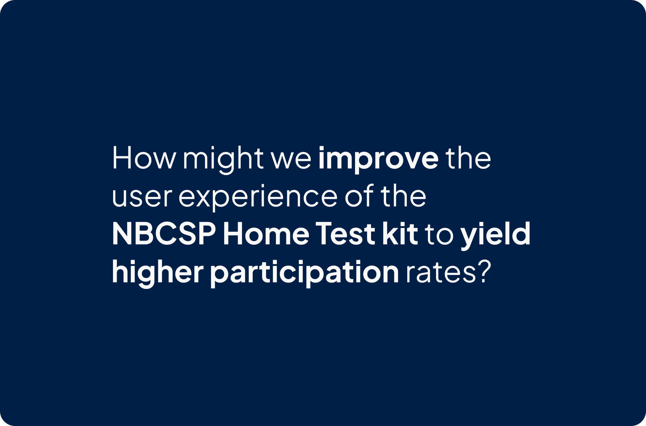
HMW Statement
The Users
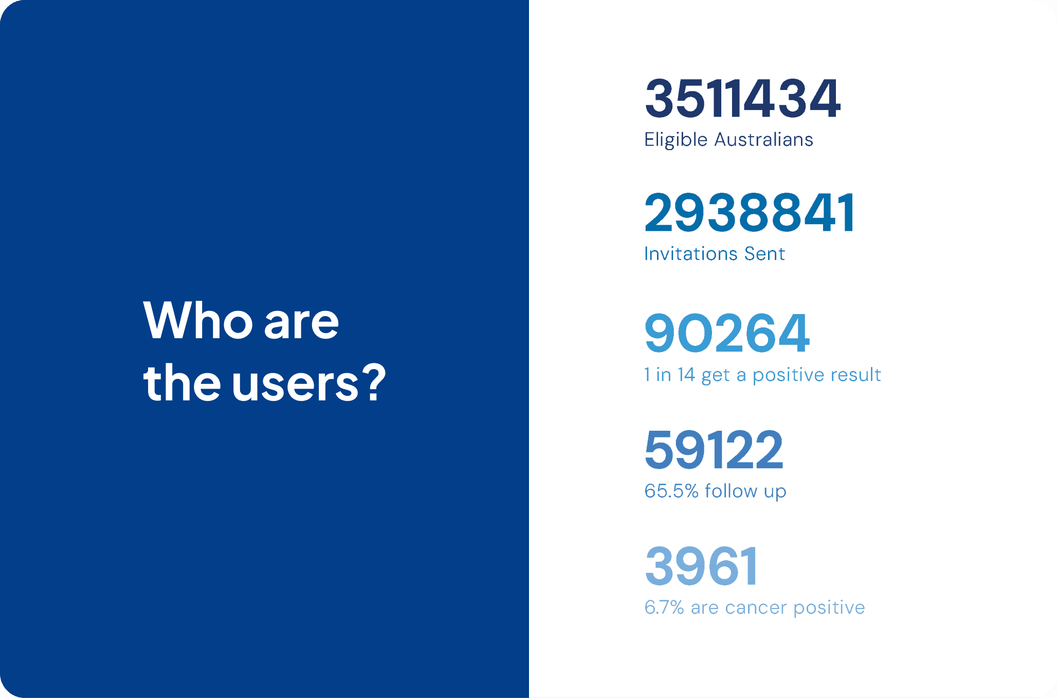
The National Bowel Cancer Screening Program (NBCSP) in Australia was initiated in 2006 and was designed for individuals within a certain age range who are at risk of developing colorectal cancer. The current program targets individuals aged 50 to 74, regardless of gender, race, and socioeconomic status.
The Problem
Low Participation Rates
The National Bowel Cancer Screening Program (NBCSP) in Australia struggles with low participation, with only 43% of the target population (ages 50–74) engaging, significantly lower than in other countries.
Bowel Cancer: A Critical Health Issue
2nd deadliest cancer in Australia, claiming 5,354 lives annually.
4th leading cause of death for ages 45–74.
Increasing participation in the NBCSP is vital to saving lives.
Awareness and Behaviour Challenges
92% awareness among the target group in 2020, but awareness is lower among younger participants (ages 50–54).
Awareness correlates with health-conscious behaviours (e.g., GP visits, non-smoking).
38% behavioural non-compliance: Many do not complete the test due to unclear instructions, discomfort, or low prioritisation.
Cost Concerns
Each kit costs $10 to send and $20 to return and analyse, amounting to significant waste:
57% non-participation means $16.75 million wasted annually.
10% received kits unnecessarily due to prior screenings.
9% didn’t receive kits due to mailing issues, affecting participation and cost-effectiveness.
Participation Trends
Older participants (ages 70–74) are more likely to complete the test (54% participation) compared to younger participants (ages 50–54, 34% participation).
Improving kit instructions and streamlining the mailing process could significantly increase participation rates and make the program more cost-effective.
Key Insight
Raising awareness, refining the kit experience, and addressing behavioural and logistical barriers are essential to improving participation and reducing bowel cancer fatalities.
Digging Deeper into Barriers to Participation
1. Hygiene Concerns
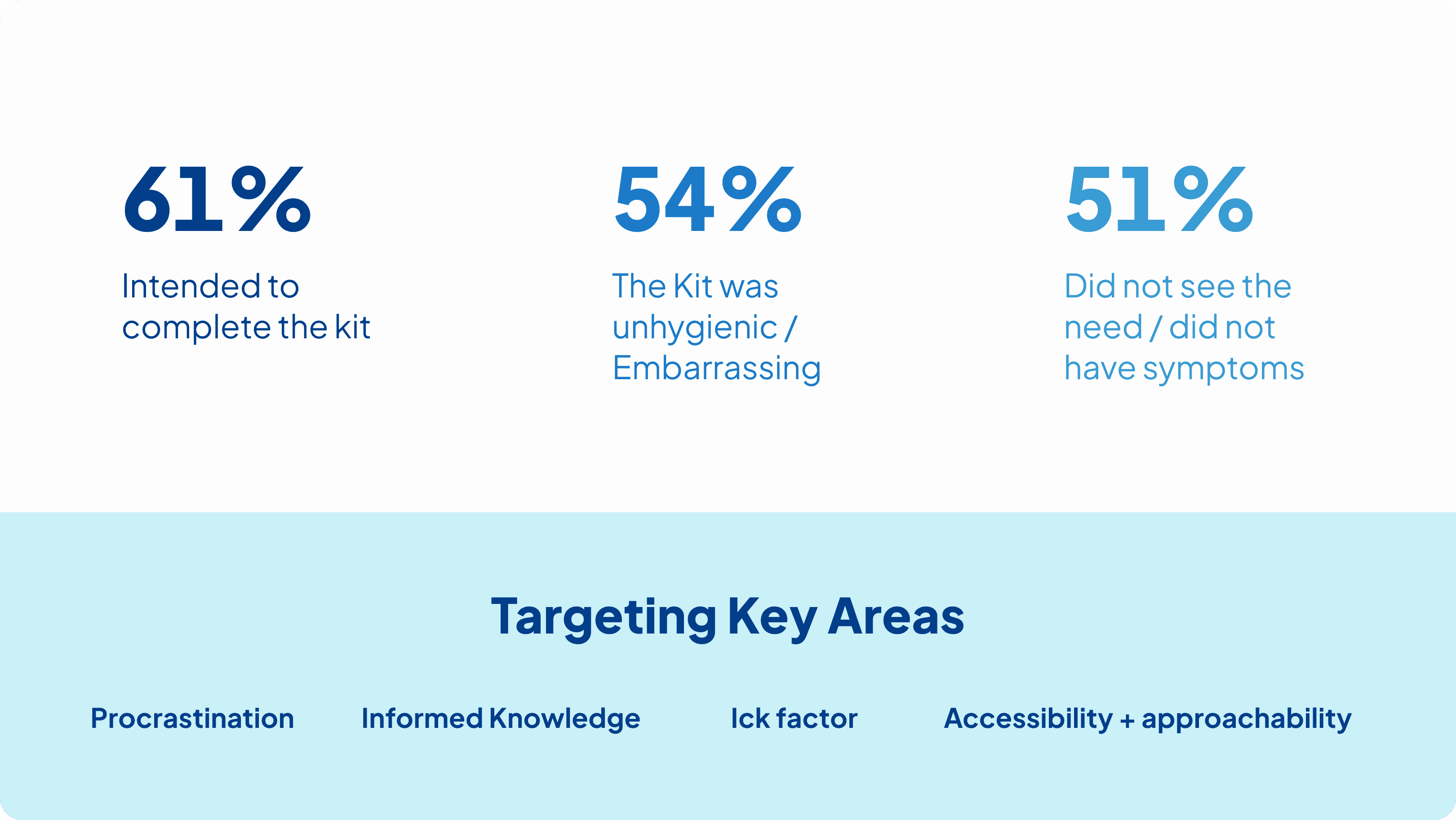
Handling fecal matter is viewed as unpleasant, unhygienic, and embarrassing.
Storing samples in the fridge adds to discomfort and discourages completion.
2. Procrastination
Many participants intended to complete the kit but didn’t due to forgetfulness or lack of planning.
The six-month expiry and a single eight-week reminder fail to create urgency, allowing participants to delay or forget.
Preventative tasks with no immediate reward and a perceived high effort are deprioritized.
3. Health Literacy
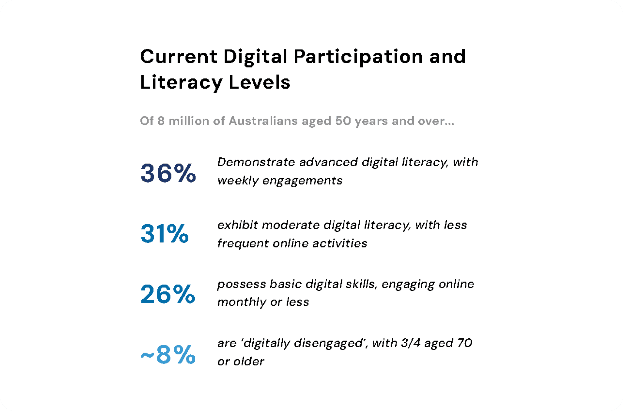
Low health literacy, particularly in rural and remote areas, leads to misunderstanding of the test's benefits and its preventative nature.
Many underestimate their cancer risk or believe the test won’t help them, with some preferring not to know their diagnosis.
4. Additional Barriers
Confusing instructions: 36% found the kit unclear.
Distrust and anxiety: 25% didn’t trust the test, and some avoided it due to fear of diagnosis.
Underuse of GPs: Limited GP engagement in rural areas reduces health awareness and participation.
Key Insight
Addressing hygiene concerns, improving reminders to create urgency, simplifying instructions, and enhancing health literacy—especially in underrepresented groups—are critical to overcoming these barriers.
We also examined effective strategies for increasing participation and analysed case studies to understand what works best.
User Research
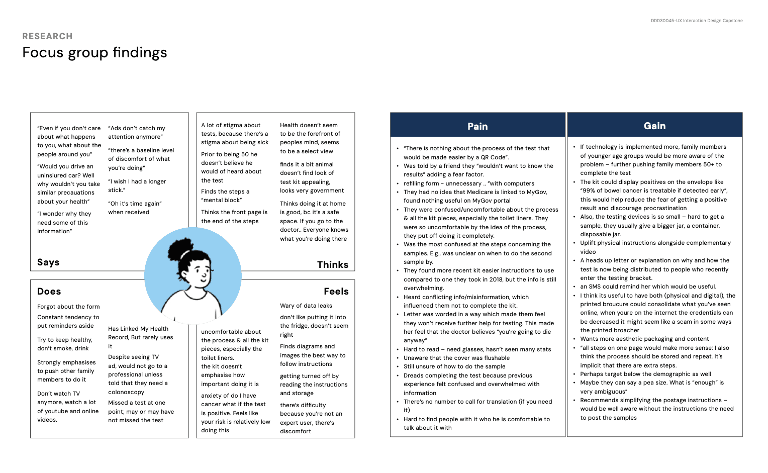
To gain deeper insights into barriers and opportunities for improving participation, we also conducted primary research and heard directly from the target audience through focus group interviews.
With our questions we aimed to ensure we asked more general, non-leading questions first. Any potentially leading questions or direct requests to brainstorm were taken into consideration with earlier answers. We wanted to touch on device preferences, other medical experience, data privacy, as well as overall function and clarity on the physical experience.
A limitation due to poor weather and recruitment timelines meant we did not get as many users as initially expecting. However we pivoted on the day, and luckily had a large degree of strong research done by various groups to base our solutions on.
This firsthand feedback provided valuable context and allowed us to better understand their challenges and preferences. Here’s a summary of what we've discovered:

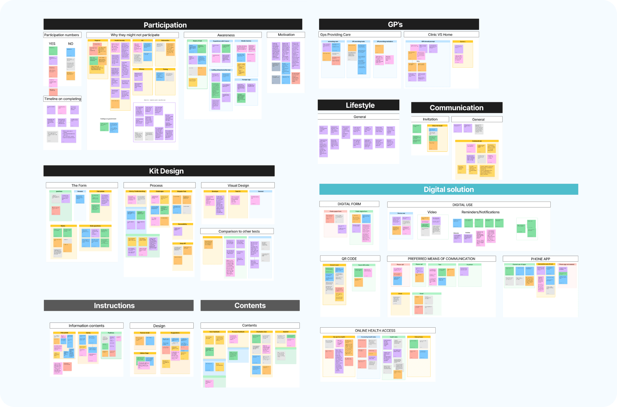
At the end of the focus group as a team we compiled a mini affinity board of what we each found valuable using sticky notes. This process was particularly valuable as due to ethics we could not record audio, and our notes had some limitations.

From here we also had access to other groups' user testing findings, compiling this was a slight challenge as each team had used different recording methods with various levels of success. And each team had asked their own set of questions, some that were not linked to user responses. We first organised each group’s answers into their own categories, from here I then compiled the overarching affinity map.
Although our sample size was very small we still found patterns within all the groups, for example an unexpected one was mistrust of the flushable liner. This was raised by all groups, users feeling uncertain about flushing it.
We also created this empathy map to refer to when we move on to design our solution.
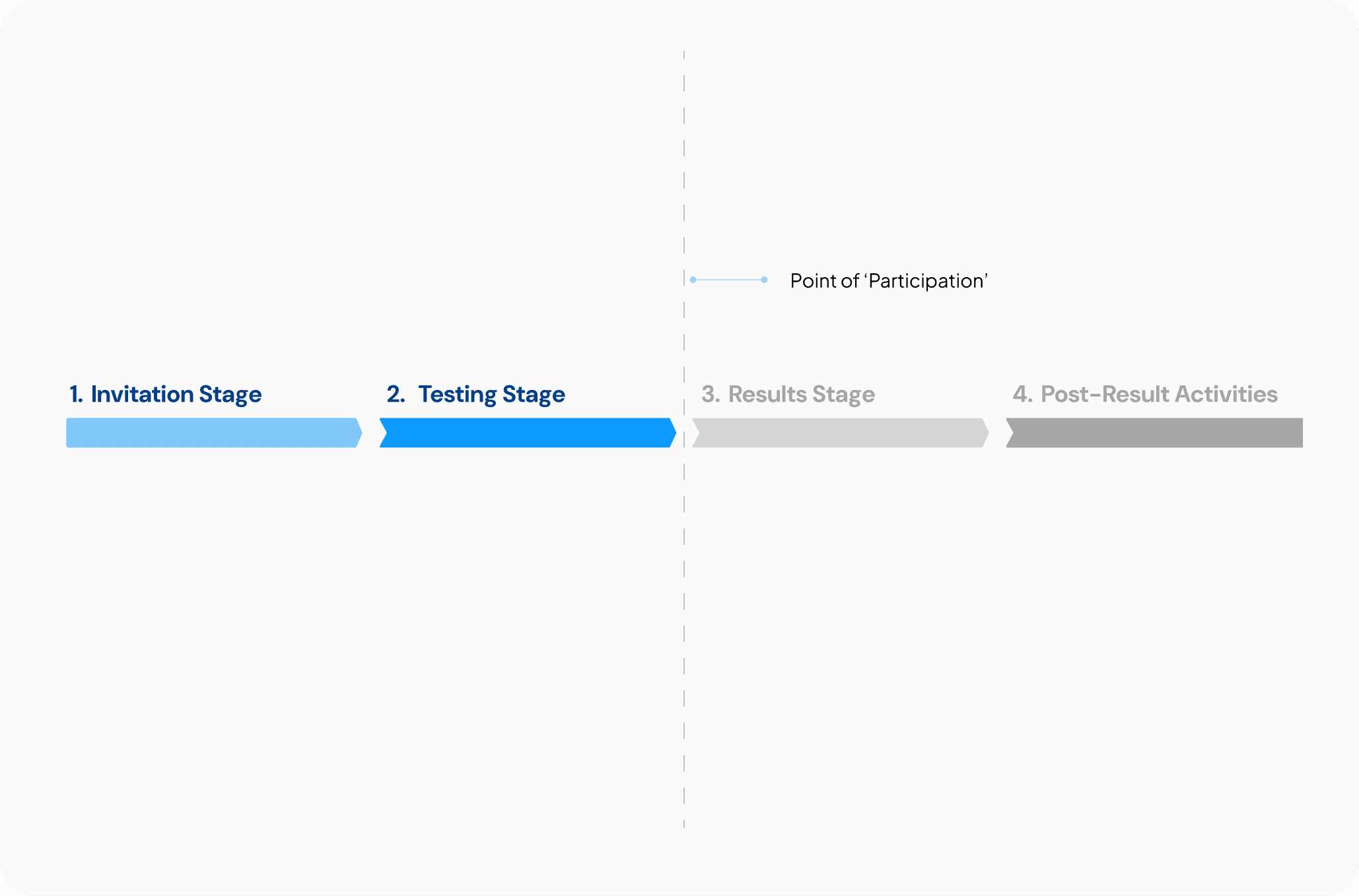
The Solution
We broke the process into four stages, with a focus on the first two, as they most directly impact participation. Recognising we couldn’t address the entire process, we concentrated on creating solutions for the touchpoints leading up to participation, ensuring our efforts targeted the key pain points.4o mini
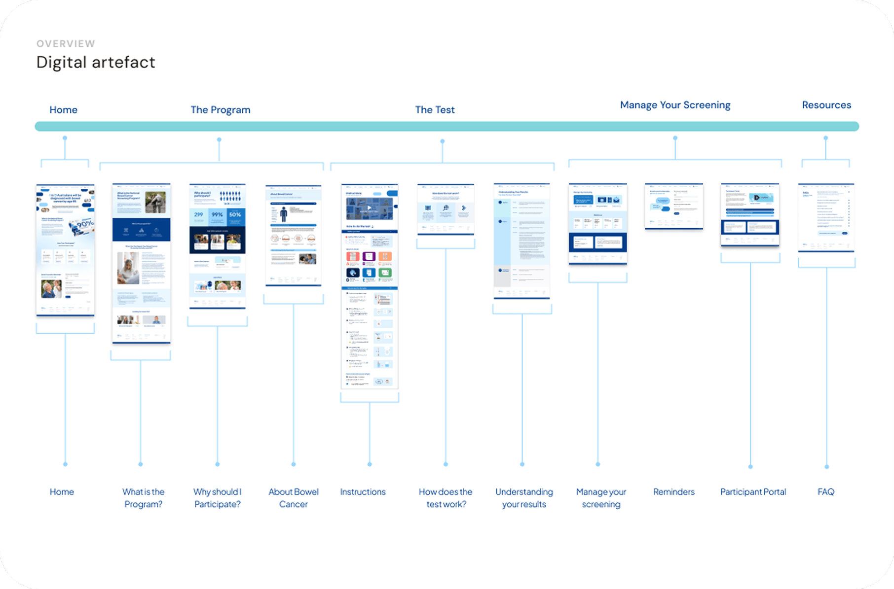
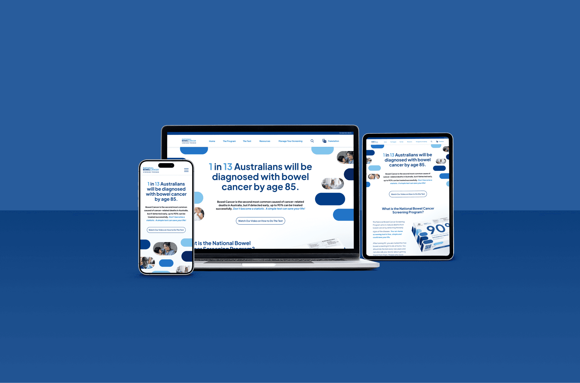
Digital Solution Overview - Website Prototype
I spearheaded this portion of the solution. Our primary goal was to address the fragmentation of essential features across multiple websites and centralises this scattered information for better accessibility.
View Web Prototype | View Video Walkthrough
Given the tight timeline of just over a week to deliver this portion, we had to work efficiently. Here's how we tackled it:
We built the prototype in Figma, and I took charge of overseeing this process. My approach was as follows:
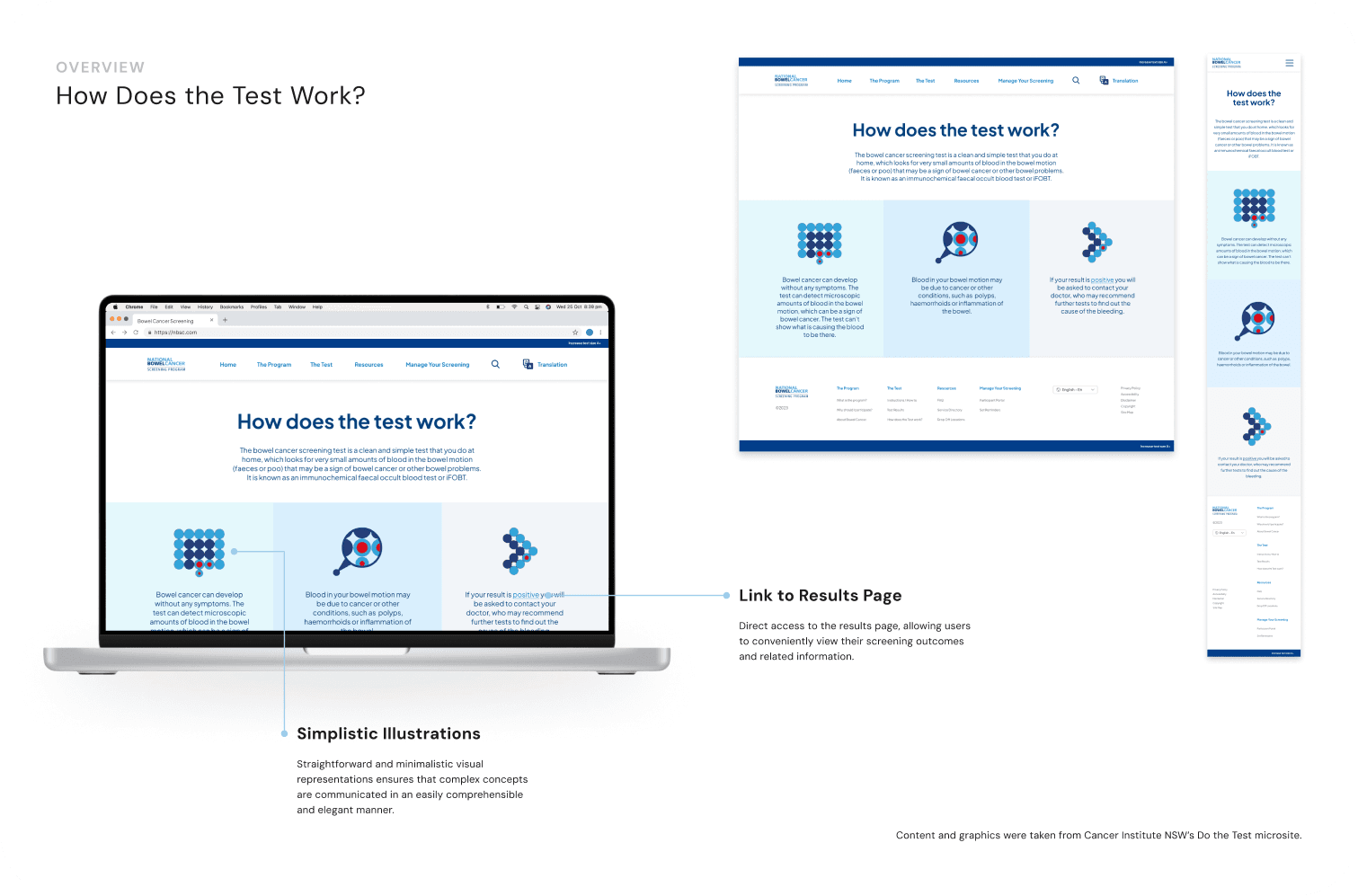
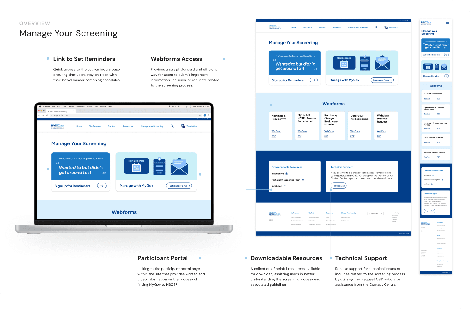
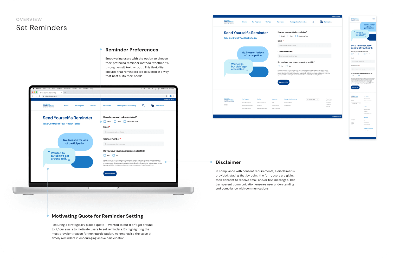
Information Architecture: I began by defining the pages for the prototype, considering what structure would best align with the user's mental model. We brainstormed many versions and landed on this final sitemap.
Design System First: We used a variable design system, allowing us to maintain a centralised colour library. This made it easy to adjust elements across the prototype, ensuring that brand colours met accessibility standards with just one update.
Design and Collaboration: For all 9 pages, I laid out the structure in Figma, ensuring easy access for peer feedback. I quickly wireframed, conceptualised, and iterated based on the input I received.
Component Collaboration: Thankfully, one of the other designers helped by creating key components like the menu and stacked component states, which significantly streamlined the process.
Responsive Design: We also kept mobile versions in mind, ensuring that the design was responsive across different devices.


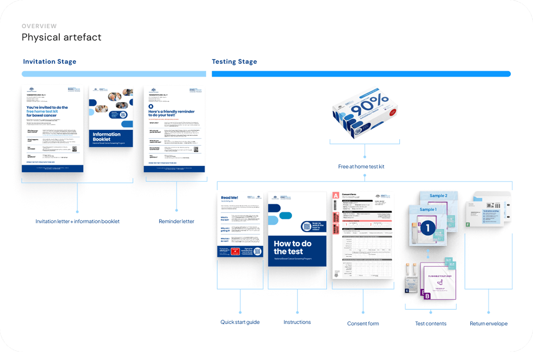
Physical Artefacts Solution and Service Design Overview
While I wasn't the lead on this section and played more of a supporting role, my teammates did a fantastic job with the physical artefacts and service design solutions. You can view these in more detail here: View Presentation
Information Booklet
Letters
Kit Design
Kit Content
Quick Start Guide
Instructions
Form

Reflections
Taking on a project of this scale with a team of seven people from diverse backgrounds was both a challenge and a learning experience. Here are my key takeaways:
Leverage each other's strengths – Everyone brings something unique to the table, and offering support when needed makes a huge difference.
Expect the unexpected – Not everything will go as planned, and not all participants will show up. Flexibility is essential.
Explore, iterate, refine – The more you research and experiment, the better your decisions will be.
Information architecture first – Establishing a solid structure before diving into visuals makes for a stronger final product.
Project management is everything – Clear roles, deadlines, and timelines keep things on track and prevent last-minute chaos.
This project reinforced the importance of adaptability, collaboration, and strategic thinking. I’ll continue to carry these skills forward in my future work!